📖 Quick Navigation
PDP Optimization
A reprioritization of the most important data points of our product details page (PDP), whilst tackling tech-debt and logistical inefficiencies.
Stakeholders
|
Timeline
|
Skills
|
Role
Product Designer in an EPD team of 10+ Engineers, 1 Product Manager, and 1 Product Designer.
Performance Metrics (Jan-May ‘25)
We A/B tested this new design to approximately 50% of our app traffic for 4 months. We were able to attribute $14M in incremental revenue with this update!
Exact efficiency metrics were difficult to capture, but we’ve reduced the number of PDP templates from 11 to 4!
Overview
In an eCommerce application, the product detail page, also commonly known as the PDP, is one of the most important views within a typical shopping journey. It plays a huge role in ‘making or breaking’ the user’s purchasing decision. The existing PDP view within the Dick’s mobile apps had a growth opportunity, and we decided to take the view to the next level.
This project aimed to tackle a couple of goals in one go:
- Alleviate operating inefficiencies by consolidating 11 different PDP templates.
- Redesign the top-level information architecture of the PDP to improve overall usability and improve conversion.
My Role & Contributions
I served as the lead Product Designer in an EPD team of 10+ Engineers and a Product Manager pair.
My role involved conducting extensive research, developing wireframes, maintaining constant communication with engineers and teammates, implementing design solutions that bridged the gap between aesthetics and functionality, assisting in writing tickets, and testing front-end related tickets during QA. The whole project lifecycle!
Challenges
- Many existing templates(11) of PDPs
- Underlying tech-debt
- Managing teammate expectations and compromising on implementation priority
- Limited engineering resources
- Tactfully sneaking in UX enhancements 😉
- Limited data from our existing PDPs
Design Process
- Identify current technical limitations, gaps, and areas of opportunities.
- Conduct comparative analysis of popular PDPs
- Design potential solution/approach
- Present findings and recommendation
- Prepare design comps for engineering & QA review
- QA test
- Launch & monitor
1. Identifying Areas of Opportunities
We needed to first understand our current inefficiencies with our PDP. Through chatting with engineering and our QA teams, I’ve found that we had a total of 11 different PDP templates.
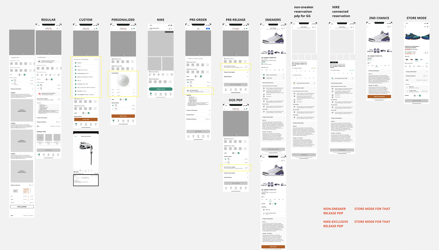
Our team’s primary operating inefficiencies were due to the fact that we had a “Store Mode” template of all of our regular PDP templates. The store mode templates were originally created with the intention of offering a better in-store shopping experience by reprioritizing and increasing the legibility of content within the PDP.
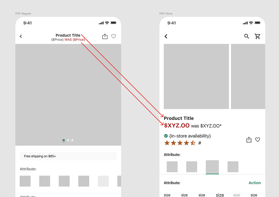 In this example of a regular template versus its storemode counterpart, data points such as the product title, pricing, in-store availability, and ratings were prioritized towards the top of the view. In addition, the text sizes have been increased to increase visibility and legibility in-stores.
Due to the many different types of templates, our team had to do a lot more work to develop and test even the smallest change made on our PDPs. Therefore, improvements to PDPs weren’t easy to take on, when in reality, we needed to constantly iterate, test, and implement new features into our PDPs!
In addition to the operational inefficiencies, we had a business requirement and also areas for general UX improvement as well for the PDPs. Lots to address with this update! To summarize, the primary requirements were the following:
- Reduce template count
- Address UX issues
- Highlight more product media
2. Comparative Analysis
It was time to look at what others were doing! What they were doing differently, how we can glean on their patterns and which of their design decisions could we bring into our apps?
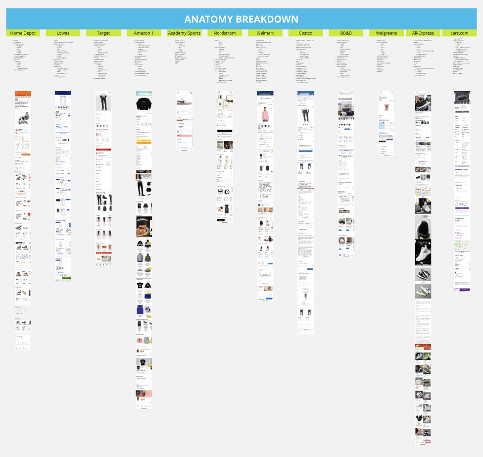 The first round of screen scraping was aimed towards learning all the different parts that made up a PDP for these competitors. I casted a wider net to ensure we’re covering more than just our average retailers. Rest assured, we weren’t missing anything major in our PDPs!
 After the first round, I trimmed down the list of competitors down a bit more to align the examples closer to our business characteristics. This would help me get a better understanding of which data points are working in the wild. I went in depth with analyzing the content within the views in order to see how much of the PDP real estate were dedicated to marketing and ads.
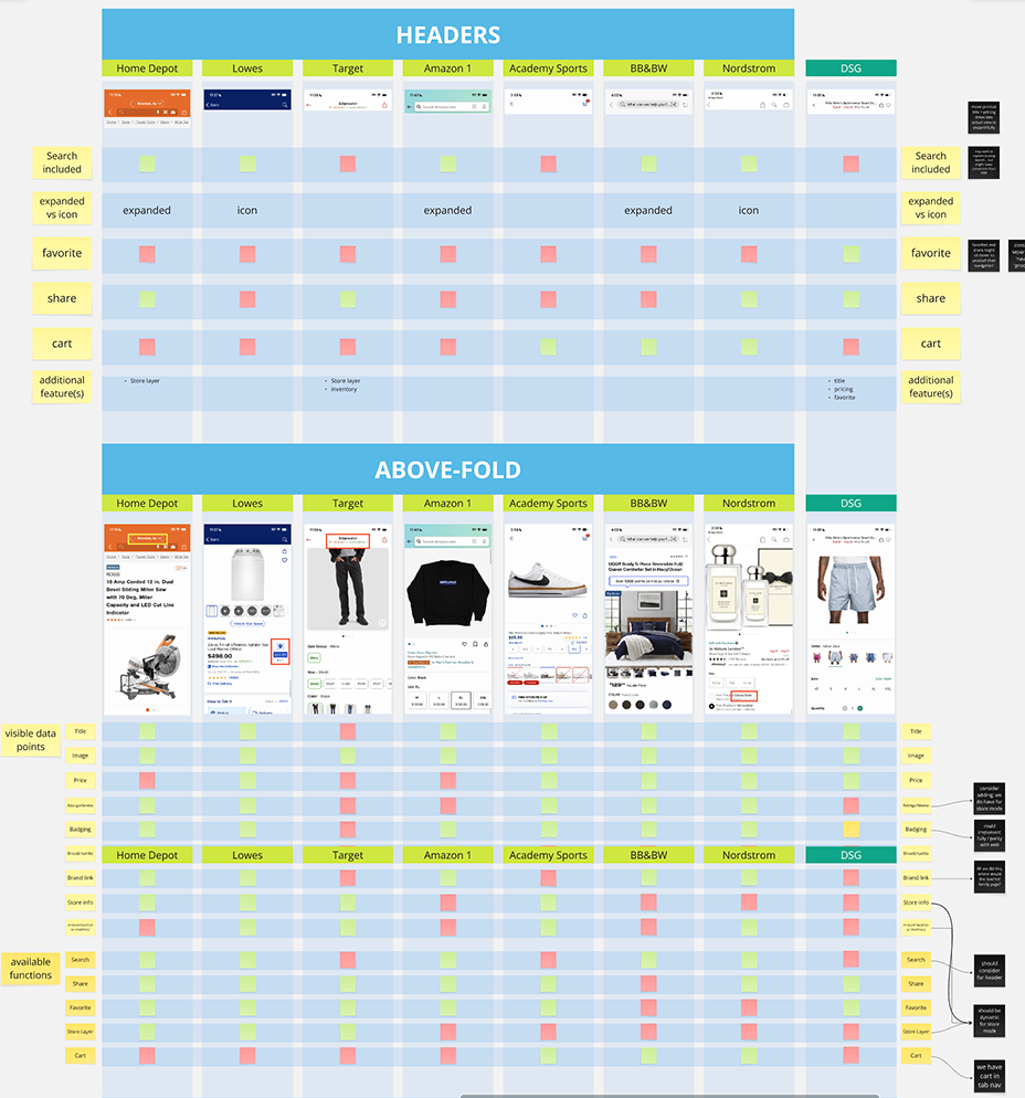
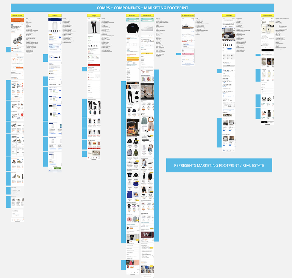
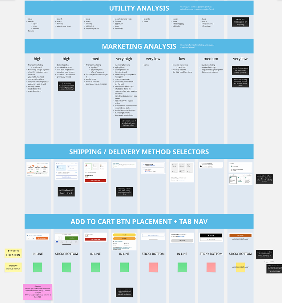 I studied the main portions of the views of the PDPs to understand why they may have been prioritizing certain data points. The most interesting thing about this last portion of the analysis was how much the business model impacts views like the PDP. For example, Amazon being a marketplace must have had an impact on the sheer volume of marketing and external gateways out of any given PDP.
Looking closer, you can also see a pattern where a single-brand, direct-to-consumer(DTC) company resorts to much less marketing content than a traditional retailer. So Dick’s being a more of a traditional retailer, we naturally have a case to showcase more products in a PDP and not just information regarding that one product.
Analysis Takeaways
- Seemingly basic views like PDP have heavy business influences
- Our PDP lacks gateways into other products
- Alernative payment options can be placed under product attribute selectors
- Creating dynamic product identifier cluster will help us lessen number of manual templates and stay nimble to different variations in product assortments
- Update attribute, QTY and shipping method selector UI’s for visual finesse
- Better distinguish navigation versus product information
- Better highlight rich media such as product images and videos
- App has too many PDP templates, some we haven’t even brought into app from web
3. Design Potential Solution
Before we design anything, we needed to make sure we’re solutioning for the right things. We need to know what we’re solving for!
UX Requirement: Consolidating Templates
The design approach was to create ‘dynamic’ components that can have its own variations depending on available product data. Whether it’s variable price points, promotion applied, store mode or not, and etc, instead of manually building out templates for the use cases, the dynamic components would be able to handle many different types of variations.
For example, the following image displays the main variations we’ve implemented for the primary product information cluster.
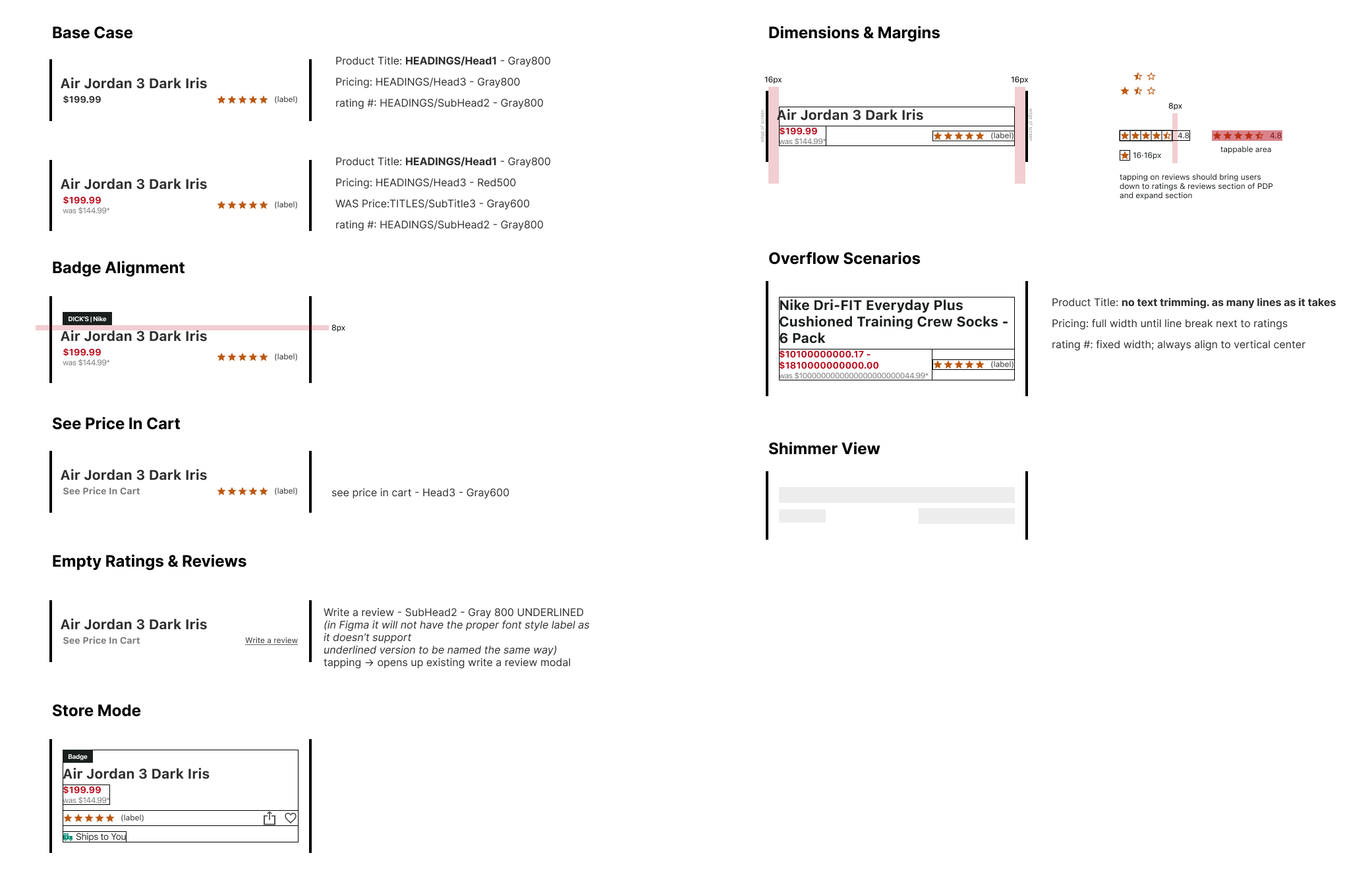
This small collection of datapoints created into a single component is capable of serving every type of product we sell: it supports badging, different pricing messaging, and accounts product ratings. Giving ample space for the product title and pricing also helped me to address an existing UX issue of users not being able to properly read longer product titles in its entirety.
The above product information cluster helped us solve a few UX issues, address stakeholder needs, all the while maintaining the best IA hierarchy above the fold:
Business Requirement: Highlighting Product Imagery
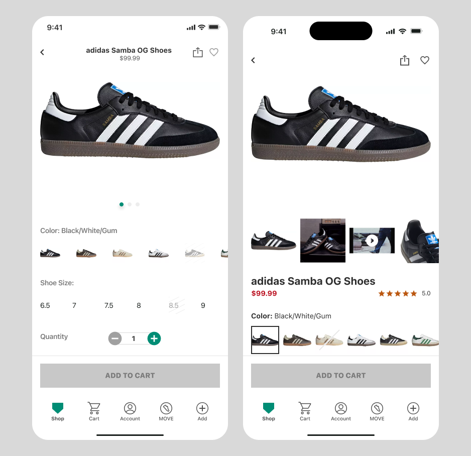 Our eComm business stakeholders have expressed their need in the app better highlighting some of the rich media that come with the product’s imagery. The existing image container (left) failed to provide an up-front preview of said media and instead brought the product attributes much closer to the top of the view.
With the new design (right) we showcase additional richer product media in thumbnails for the users to quickly scan and be exposed to at a glance.
Product imagery doesn’t stop there at the top! We’ve also enlarged the thumbnails for our colorway selectors to give our users a better and more accurate representations of product colorways.
General UX Enhancements
 In addition to enlarging the product thumbnails and increasing the selection cues for the product attribute pickers, we’ve made additional UI updates to give the overall PDP a visual uplift.
Although a fast-follow to the MVP launch, the fulfillment/delivery tile update was also done to top off the visual polish and tidy up the display logic.
4. Present Findings
After many rounds of design syncs and a few design alignment & critique sessions with other designers on our team and the web teams, the designs were semi-finalized. Our product manager and I then took said design recommendations to our engineers and walked them through all the details and flows.
If a project has direct eyes of the business stakeholders, we would very much let them in throughout the whole process, and take this opportunity to present our findings out to them as well. But for this project, it was more of a “let’s just go do it” kind of deal. ☺️
5. Prepare Designs
We usually take as many sessions as needed to get everyone involved in the building and testing of the designed solutions to understand what is being proposed. In addition to this semi-final walkthroughs, we do bring in engineers to sit in on our design reviews ahead of time to ensure we’re covering all the edge cases and considering technical limitations.
There is always room for improvement, so these final design reviews prior to tickets being written are also times for engineering and QA feedback.
This is also where design is often required to make compromises with the engineering team. Due to resource constraints, engineering is often asking design to pull back on design complexities such as data preservation, transitional animations, and complex display logic.
For this project, we had to compromise on updating the attribute pickers, and the fulfillment tiles to post release. Even though for the sake of this case study I grouped it into one flow, said features went in post MVP. So technically, the incremental revenue could be purely accounted for by the IA and image gallery updates!
6. QA Test
What’s better than testing our own designs in an actual build!? Nothing is more satisfying than seeing the pixels be perfect, margins and spacing all crisp, and the transitions and animations are on point! I can’t thank engineers enough for all those reopened tickets for “slightly off” UI elements.
We test our own designs and ensure everything is as intended, then close out the tickets.
7. Launch & Monitor
Then we had to wait until our analytics platform, Adobe Analytics, had enough data for us to reach significance in the performance metrics. After about 2 months into the push to production, we saw a tiny bit of a drop in the “Add to Cart” rates (decrease not significant enough to pull the plug!). Because we didn’t see a drop in any other success metric such as conversion and revenue, we kept watching until the revenue impact met significance.
Another month or so after, we were able to attribute an incremental lift in revenue of about $14M! We immediately guessed that the “Add to Cart” rate fell because our users had a better idea of what product they were looking at. (in hindsight, we should’ve watched the cart deletion rates to account to counter this theory!)
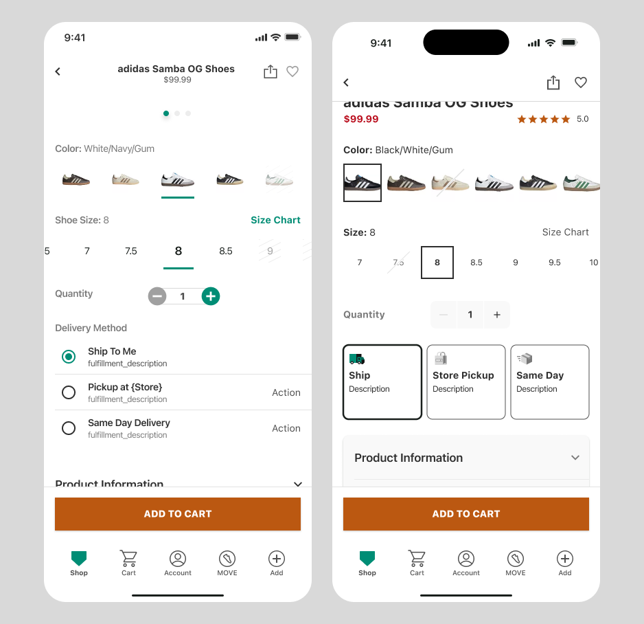
Before & Afters
PDP Landing View
The top of the IA of the PDP has been reworked to prioritize the product information that our users have ranked the highest in terms of importance: product image, name, price, sales/promotions, and reviews.
We maintained the common actions on PDPs such as share and favorite at the top header. As mentioned previously, we displayed more product imagery to increase visibility to rich content such as product videos.
PDP Body View
In addition to the top IA restructuring, we updated the UI of all the interactive elements for a visual uplift. The product attribute selections such as the colors and size pickers were enlarged for enhanced legibility, scannability, and tappability.
Another big part of the visual update were in the fulfillment tiles such as Ship, Pickup in Store, and Same Day. There were lots of intricate display logic and data being sent back and forth for the fulfillment options, so a close collaboration and extensive design specifications were needed.
Takeaways & Next Steps
Designers are often asked to cut back on designs, and I feel like its a constant battle with myself to not get too carried away with a feature or a specific piece of a UI element. But there are those times when that far-future vision is needed to sell! I guess I will forever catch myself between the two “modes” of thinking when designing 🥲.
I learned first-hand (again!) that there is truth in the popular psychological phenomena, Aesthetic-Usability Effect that basically says “what looks better, works better”. Of course, this phenomena can’t and shouldn’t be attributed too heavily in the project’s success, as the obvious IA restructuring and product imagery enhancements have made the biggest impacts. However, to most of our users, it probably was a minor update that largely went unnoticed. But the numbers don’t lie!
The realities of being understaffed with ever-rising expectations of deliverables by the business, we were/are not able to dig further into the results and conduct additional refinements. But had we the time, we would dig into usage metrics at a component level for the entirety of the PDP and set a baseline, and begin iterating on the components to net the best results.