📖 Quick Navigation
Modernizing eCommerce Apps
A comprehensive modernization of the Dick’s Sporting Goods and Golf Galaxy mobile shopping experiences.
Stakeholders
|
Timeline
|
Skills
|
Role & Contributions
Product Designer in an EPD team of 20+ Software Engineers, 1 Product Manager, 2 Product Designers, and 3+ QA Engineers.
I played a pivotal part in redesigning our 4 mobile applications:
- Dick’s Sporting Goods - iOS
- Dick’s Sporting Goods - Android
- Golf Galaxy - iOS
- Golf Galaxy - Android
Performance Metrics
As of 2022 (YoY)
- 1 year post relaunch: MAU +100% at 1.4M users and revenue +22%
As of 2023 (YoY)
- 2 years post relaunch: MAU +31% at 2.2M users and revenue +76%
- CVR rate 4.41%
- Sign-in rate 94.4%
Overview
| The goal of this massive project was to completely redesign and rebuild a suite of mobile apps that served as the primary retail (iOS & Android) applications for the business across two different brands. Our team was responsible for the research, design, development, testing, and the maintenance of the applications. |  |
Challenges
- Outdated back-end APIs & patterns
- Frankensteined app architecture
- Heavy dependency on existing web-services
- Uncharted territory of technology for business partners
- Managing multiple brands & platforms
- Limited resources & tight deadlines
Design Process
- Understanding current states
- Defining baselines
- Visioning and aligning on outcomes
- Design, test, launch, and iterate
1. Understanding Current States
During the initial phases of any project, I gather data and information about the product.
Means of gathering data and information may include (but aren’t limited to):
- collaborative team sessions
- interviews
- comparative/competitive analysis
- service blueprinting
- journey mapping sessions
User Flows
I broke down the shopping journeys of users in our existing ecommerce section of the apps. Interviewing and conducting user testing helped me understand where the users’ pain points were, and why they may be experiencing them.

Service Blueprints

When dealing with complex systems/products that involve many teams, I find it helpful to start with a service blueprint. I do this before diving into users to better understand why and where users may have pain points.
This version of the blueprint contained:
- user flow
- front-end UI
- user sentiments (assumed UX frustrations)
- back-end service calls
- teams & stakeholders responsible
Identifying Stakeholders
 Understanding who else shares the piece of the pie is important, as products aren’t made in silos. The mobile app was a special case, because the business hadn’t invested much into them. However, once we asked our immediate stakeholders, it seemed like everyone had some say in what happens with and within the app.
Current State Summary
The then-current state of the mobile apps was a hodgepodge of native and web experiences. Poorly-managed hybrid experiences often led users to many UX pitfalls. There wasn’t a single fully-native experience flow in the mobile apps and thus left users frustrated and reluctant to come back.
TL;DR: The app was basically a mobile website wrapped in a native app!
Let’s take a deeper dive into the issues and areas of opportunities.
Web Wrapper Limitations
| On the right is the then-current search results listing page. Being a web-wrapped view, the view had two layers of top header navigation: native app header and the web view header right underneath. These two seemingly similar navigation bars had very different destinations in the app, which was very confusing for our users. In addition, the amount of information above the fold unrelated to the user's current primary goal/task inhibited users from easily seeing the related and more important information. On a smaller device, users would not be able to see anything related to products above the fold. |
|
| Being a native app, it was common for users to be able to quickly switch between multiple contexts. For example, whilst shopping on one part of the app experience, switching context to their account information or past order histories. This singular and linear navigational flow was a big area of opportunity that served as a basis for many different user flows. |
Lack of IA Structure

|
On the left was the main landing view of the mobile app back then. You can see the hamburger menu that was placed at the top left of the header. Below is the expanded hamburger menu the users were presented with once you tapped on it. It was a culmination of literally throwing together all the features and intra-app destinations in one menu. Even within the menu, there were no logical groupings nor particular prioritizations applied. |

|
2. Defining Baselines
In order to start creating a good baseline for us to build towards, we needed to understand what the competitive landscape was like. It is also one of my favorite ways of gathering information regarding an existing feature or flow. We utilized comparative analysis and heuristics evaluations to identify common practices and gaps in our experiences for improvements and implementations.
We went in depth into which native device features such as cameras and voice integrations, order tracking, and etc. that others were utilizing to their benefits. Because we had to quickly prioritize our features to launch, we grabbed a list of must have’s versus nice to have’s when it comes to a native mobile shopping app.
In addition to features, we compared the views step by step for all of our competitors to ensure we weren’t forgetting any features during every step of the shopping journey for our users.
Comparative Analysis
 (Above) Identifying common features and patterns helped us to establish a clear baseline for a native shopping app
 (Above) 2nd round of competitive analysis for the “nice to haves”.
 (Above) User flows and general IA comparisons
After looking at enough flows and views, you start to see a general pattern and rough outline of a shopping flow. Comfortable and familiar shopping flow should be what we aim for.
Defining User Base
Understanding existing user-base and aligning on our future and potential users were done through stakeholder alignment sessions, share-outs and internal team sessions.
We relied on internal teams to understand our (then) current user-base via a demographics research results.
Type of data we gathered (but were not limited to):
- income & education level
- location by state
- marital status & children
- features most used in our app
- app usage frequency
- most wanted feature(s)

 Understanding the current userbase helped us consider which other competitors to keep our eyes on and consider as the “primary” and “secondary” competitors. We gleaned a lot of insights and patterns from said competitors.
3. Visioning and aligning on outcomes
After a rough outline of a shopping user flow has been defined, we put screens to each step of the flow and presented out our research findings to the business.
We presented out a shopping journey that we thought painted a good picture of where we should aim to be to stay competitive in the market. We needed to remind the business that the release/rollout wouldn’t be immediate but that the updates would come in large chunks, followed by smaller updates.
Updating a product in chunks keeps user-facing changes minimal and gives users ample time to adjust to the changes and lowers barriers to entry to the updates.
4. Design, Test, Launch, and Iterate
This is when we iterated on the designs previously showcased to our stakeholders. After many design critique, jam, and brainstorming sessions, we landed on design we were comfortable with continuing with.
We created high-fidelity tappable prototypes via Figma to user test our MVP designs. We conducted an unmoderated user test via User Testing, and asked the test participants to carry on shopping-related tasks on their phones:
- Searching for a product
- Accessing product information
- Adding product(s) to cart
- Checking out
- Finding order information/history

We tested with 30 iOS users and 30 Android users to ensure our high-level flows followed common mobile app shopping patterns that the industry had established.
 It wasn’t anything super fancy, but it was honest work, and our test participants approved of our newly designed experiences.It felt relieving to have our designs validated.
Launch and Iterate
When the development was done, the whole team spent weeks to test our end-to-end experiences. We caught many bugs along the way, but squashed 99% of them and de-prioritized the remainder for another sprint post-MVP.
Ever since that launch, we’ve been continuously monitoring and making improvements to our apps to this day.
Before and Afters
Here are some of the main views that have been newly designed and pushed to production, and their older versions for comparison.
Main Landing View

Before: Original hybrid app design |

After: Revamped main landing view |
Revamped Global IA
Original hybrid app consisted of many nested experiences inside one hamburger menu. We dedicated a few bottom navigation tabs for some of our major experiences to flatten the IA and give ample real estate for users to complete tasks in their dedicated spaces.
Hero Component Wins
Our websites always served up a large hero image for marketing and advertisement purposes. Defining and cleaning up the main landing view of our apps gave us room to keep the omni-experience consistent.
Increased Speed to Product
Instead of relying only on the search bar to help users get to products, we took our taxonomy up-front and center.
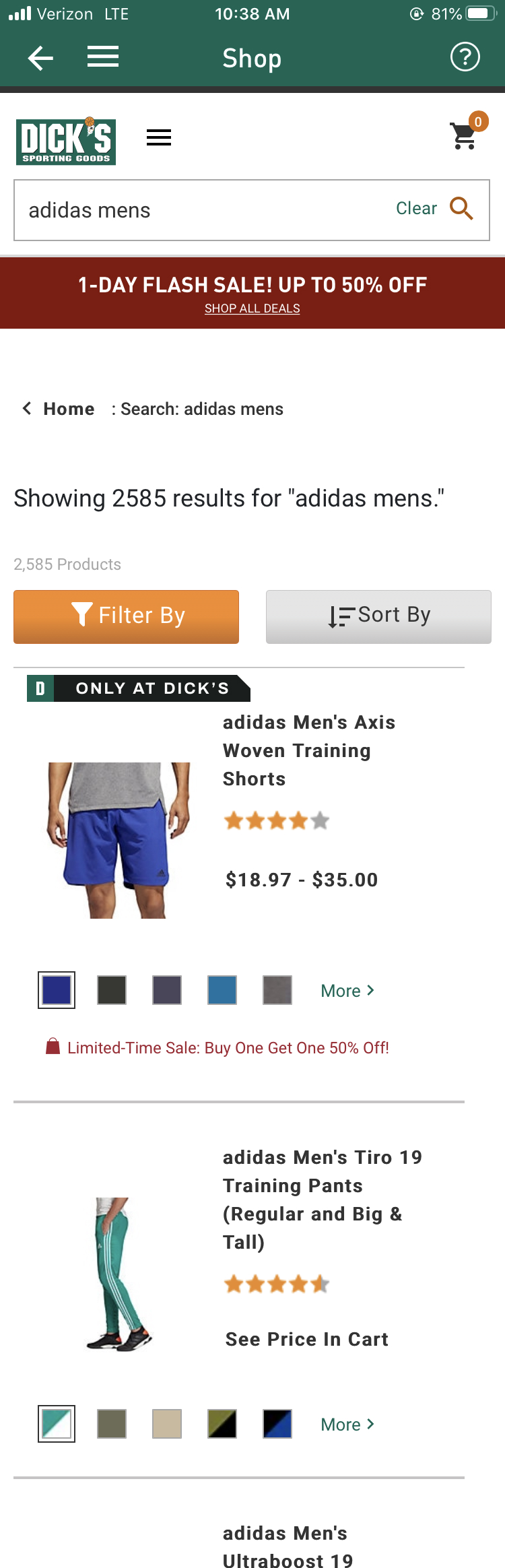
Search Results View

Before |

After |
Fully Native
Going fully native meant we have full control over the global and local navigation of our users, wherever they were in the app.
Straight to the point
With all the web-tied components out of the way, we were able to provide our users with their search results that much quicker and up-front!
New beginnings
The MVP was far from perfect, but it proved to be a solid basis for us to continually test and improve upon.
Product Detail View

Before |

After |
Fully Native
Benefits of not needing to display additional navigational elements helped us visually prioritize the most important elements of this view–product related information! For example, in the legacy PDP, users couldn’t see anything other than part of the product image well below the fold.
Takeaways
Looking back at this enormous project, I learned how to translate desktop/web experiences to native mobile ones. Inherently, desktop experiences have to be different because they’re presented and interacted with differently by users.
Interactive vs non-interactive elements, tappable areas, native iconography, device nuances, SDK patterns, and etc. There were countless differences we had to consider, whilst maintaining the same back-end services as that of our desktop experiences.
I also learned to leverage people for existing knowledge. Countless side chats, DM’s and meetings were had in order for me to understand what they knew about their respective spaces. Communication is key… but really.
Managing expectations with stakeholders and educating them wherever necessary. Not everyone in the company is as tech-savvy as us in tech. This is one of the first lessons I learned a while back, and put to action while interacting with business and marketing folks that were involved in this journey. I made sure to simplify discussions so anyone and everyone could understand what was being discussed.
Understanding code and knowing how to effectively communicate with engineering helped me immensely throughout all my projects. Effective communication is helpful in any setting, but in tech, especially between engineering and other disciplines, is an underestimated skillset. Being able to talk the same ‘language’ as engineers/developers makes a world of a difference when talking design-to-code (for super obvious reasons).
Note: This case study is actively under construction. Reach out for any additional information you need/want. thank you!