
Project Overview
City of Detroit’s Public Services Tool - A comprehensive UX research and analysis project for improving public service accessibility.
Project Details
Client: Data Driven Detroit
Timeline: Mar 2018
Role: UX Volunteer (Team of 3)
Skills: UX Research, Iterative Design, Presenting, Client-facing
Project Brief
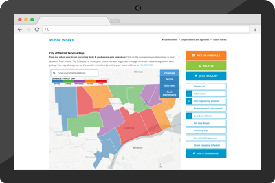
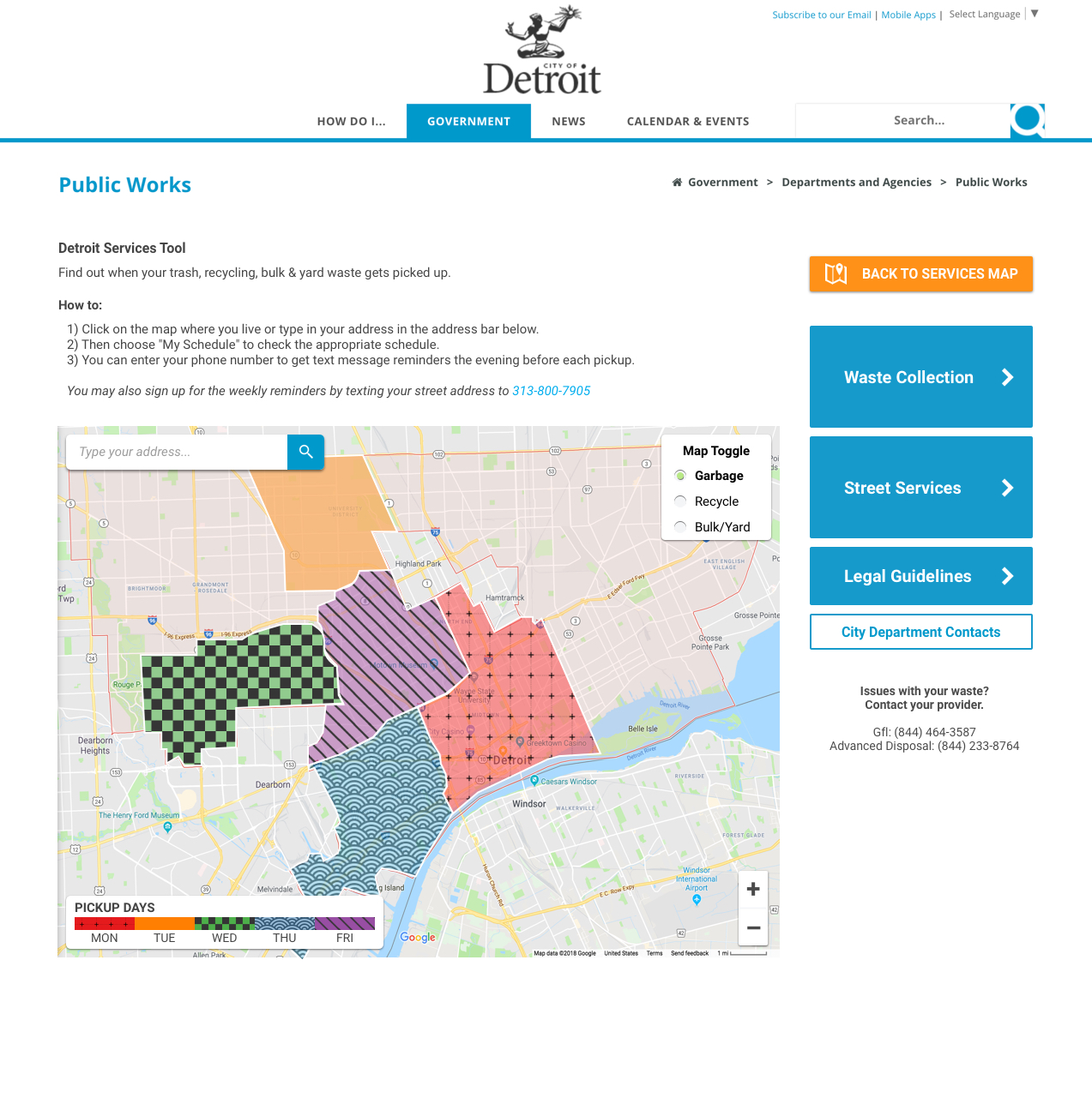
Data Driven Detroit has requested our team to conduct an initial analysis and research on the usability of the City of Detroit’s Public Service Map tool. This tool serves residents in providing various information regarding recycling and waste management. Additionally, the interface where this tool resides contains other helpful resources and information that the Public Works Department offers its Detroit residents.
I served in a team of 2 other student designers to evaluate the then-current state of the Public Service Map tool, and made design suggestions to enhance its usability.
Goal
To gauge the then-current status of the Public Service Map tool in terms of general usability, assess issues, and propose design recommendations. Our team undertook a few initial UX research methods that deemed to fit the amount of time allotted.
Heuristic Evaluation
We began the analysis by creating an in-depth analysis of the tool through heuristic evaluation (as per Nielsen’s Heuristics). The following are the two lowest-evaluated heuristics.
Evaluation Results
“User Control & Freedom” The system failed to support users in taking back their mistakes and recover from errors. The tool often left users to deal with their own mistakes instead of helping them undo their actions.
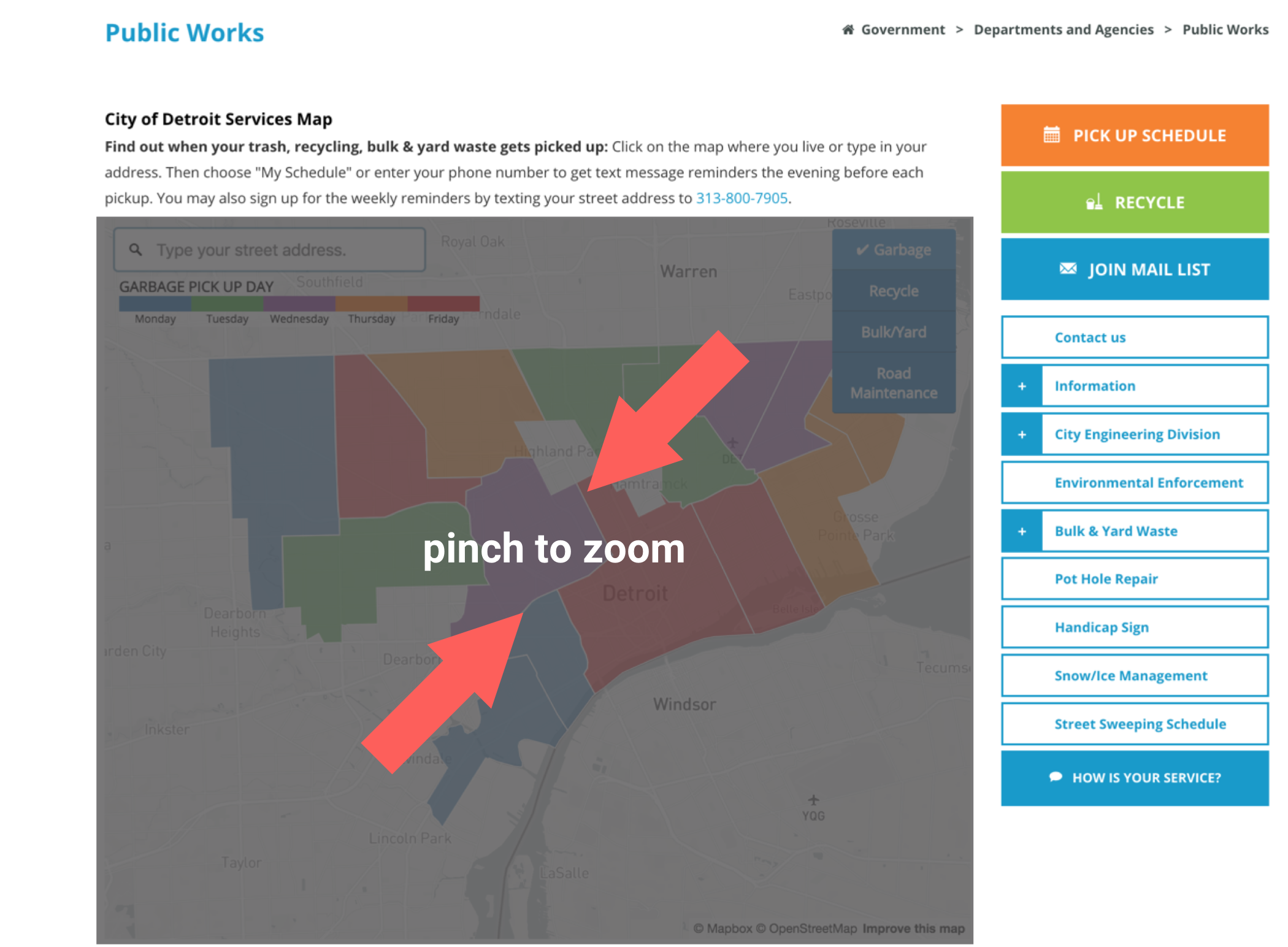
“Flexibility & Efficiency of Use” Generally, the tool lacked flexibility and required users to click many times to navigate through. For example, the map had an auto-focus feature whereby the map would focus into the exact location when clicked on. The users had no way of zooming back out.
Usability Tests
The team designed three user scenarios with varying difficulties to test whether the web interface can support users in accomplishing information-search tasks. Three Detroit residents were recruited to participate in the tests. Each were compensated with $20 gift cards thereafter completion.
Findings
“Follow Conventions” The map tool did not support conventional online map interactions, such as dragging and/or pinch-zooming, which confused users on how to navigate through the map tool.
“Allow users to take it back” The map tool failed to offer users a simple and easy way to take back on their actions, do not leave users stranded after making a mistake!
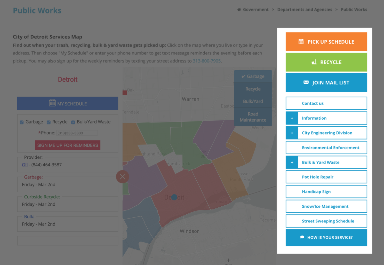
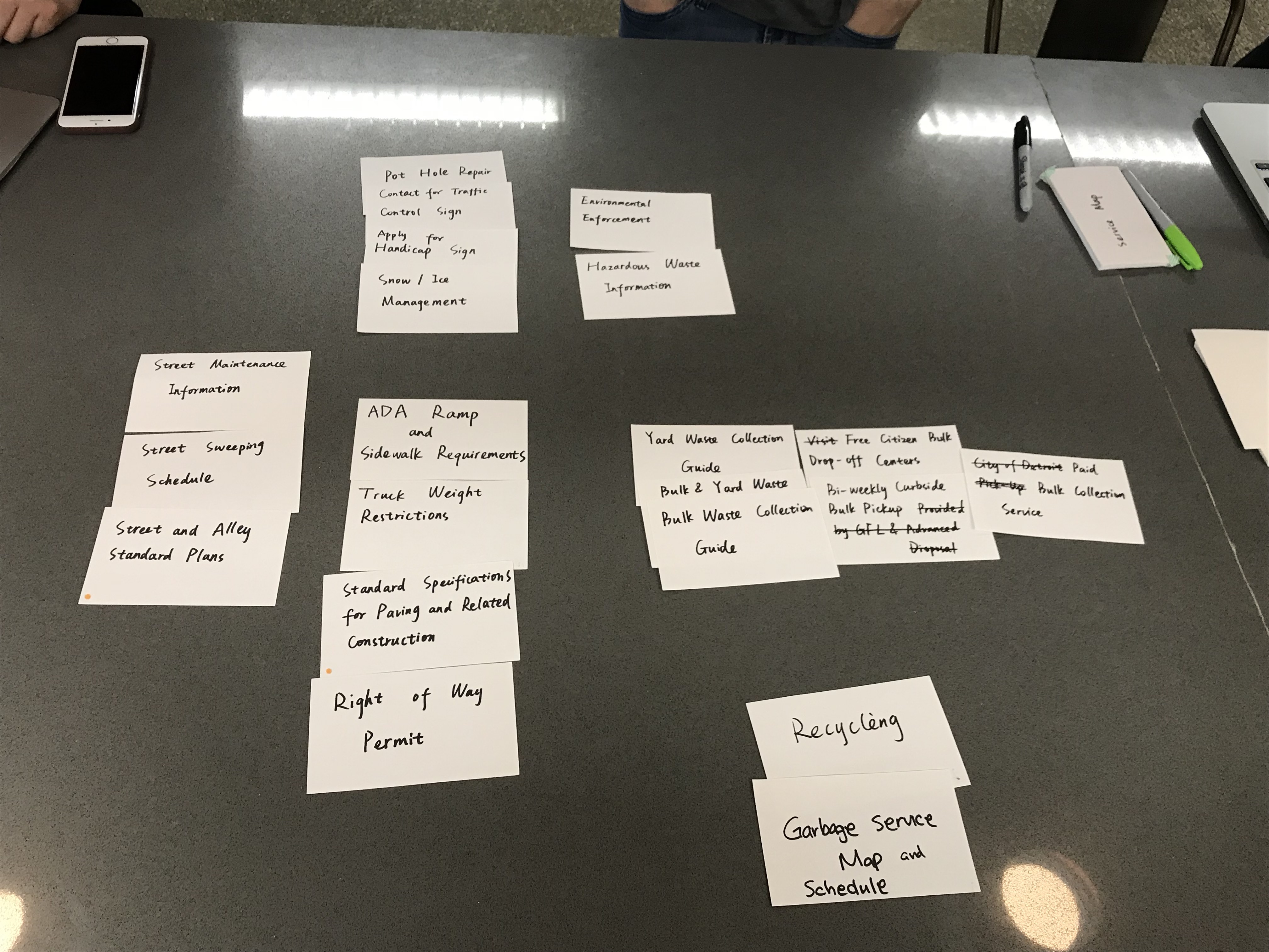
“Information Hierarchy” The website in which the map tool existed contained a collection of helpful links on the right-hand side in a form of stacked-vertical navigation. This tool confused users of its disorganized hierarchy and relevance.
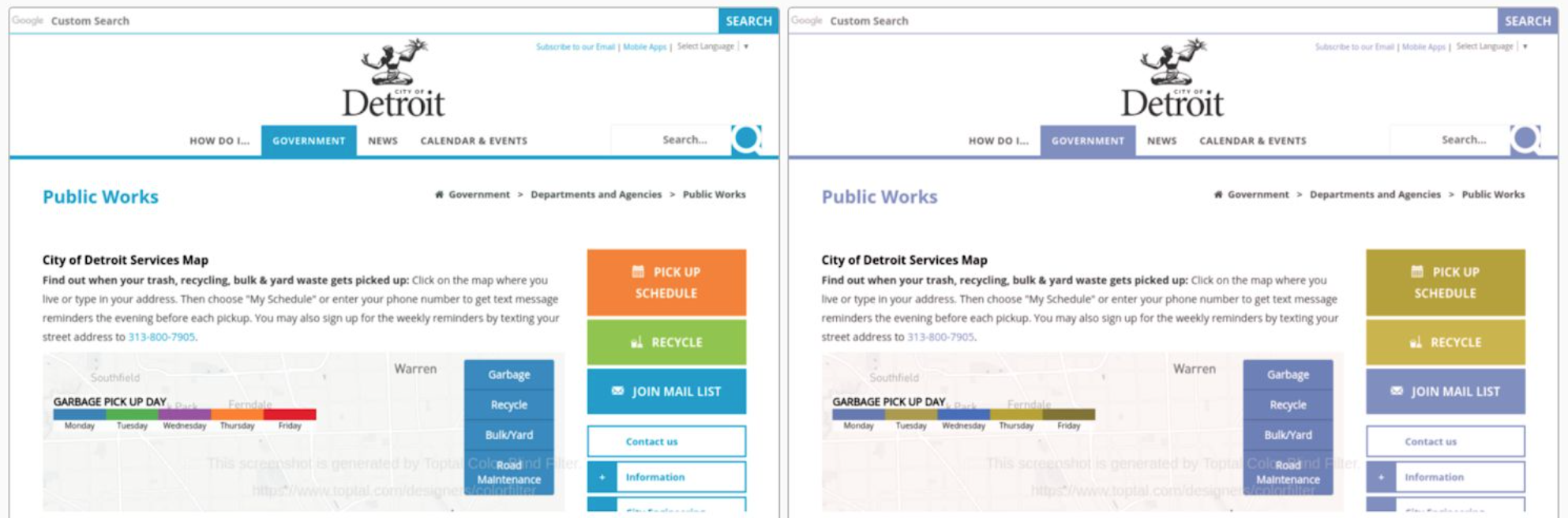
“Your users may be color blind!” Our team found that the color-coding of the map failed to pass the color blindness test, where the color coding may confuse and mislead color blind users. The image on the left-side is the original interface, and the right represents a view from a color blind user.
Card Sorting
After conducting the heuristics analysis on the tool, the team created a list of major functionalities of the tool in its entirety. One of which was the use of the right-hand side navigation for various information retrieval. The following is the list of our major findings gathered from the card sorting exercises.
“Wording has to make sense!” Card sorters had no idea what most of the links meant. If the only method of communicating with users is through text, it best speak the users’ language for starters.
“Sort by Relevance” Think about why users would use this feature, then focus on the actions and primary topics users would relate to this feature. This tool was made to make garbage disposal information easily accessible, so that information should become the focus.
“Nest(nest(nest)(ing)) information is confusing” The right-hand navigation menu nested various information within each other, confusing users as to why that was. When nesting relevant information together, users must find them relevant!
Design Improvements
After compiling the insights gathered, the team drafted a final summary of findings and design recommendations supporting the goal of the project. The clients and stakeholders of this system were professionals who aren’t familiar with technical UX-terminology, which was closely considered whilst documenting our findings.
Design Improvements
Reorganization of Navigation Elements Users tend to assume grouped items to be related
Reword navigation titles Users were confused as to who the links were meant for, construction workers, business owners, or the residents? When naming helpful links, keep a primary action in mind and who might be visiting the link.
Consider using popular APIs Many users are familiar with the interaction functionalities of Google Maps, whether it be on the Web or on Mobile devices. The interactions supported by Google Maps API are easy to adopt for a wide-range of audiences!
Consistent color-use Using colors consistently and appropriately will make it easier for users to navigate through the tool. Always keep in mind that users may be color blind and will need additional methods of distinguishing between elements! Patterns and numbers are easy alternatives.
Design Mockup
What’s a design project without a final mockup? All hands were on deck!
Feature Implementations
Side-Navigation. Redefined
- Elements categorized by primary actions
- Increased font-size for enhanced readability
- Greatly increased button size for improved accessibility
Pattern-coded Map
- Use of patterns in addition to colors for improved accessibility
- Visual distinction made quick and easily
Improved Wording
- Empower users relatable text
- Increase tool dependency by users instead of leaving them feeling helpless
Takeaways
Never Assume Users Are Able Whilst interacting with residents, our team learned that not everyone interacting with digital devices and interfaces are visually capable. When engaging with civic-technology that supports a wider age-range of users, designers must always keep accessibility in mind and craft an inclusive and accessible interface.
Keeping Navigation Elements Relative The card sorting exercise for this project was the most intensive card sorting exercise I’ve ever practiced. Through it all, I learned that users tend to have a single primary action in mind while sifting through navigation text. They imagine one final action they wish to achieve and find relevant text on the way.