Project Brief
The Order Experience team at Dell is currently exploring ways to make products easier to buy.
In line with this idea, they wished to test the user experience of the comparison feature, which allows users to compare laptops on Dell.com.
I worked in a team of 3 other student designers to evaluate the then-current state of the feature, and made creative design suggestions to enhance the usability.
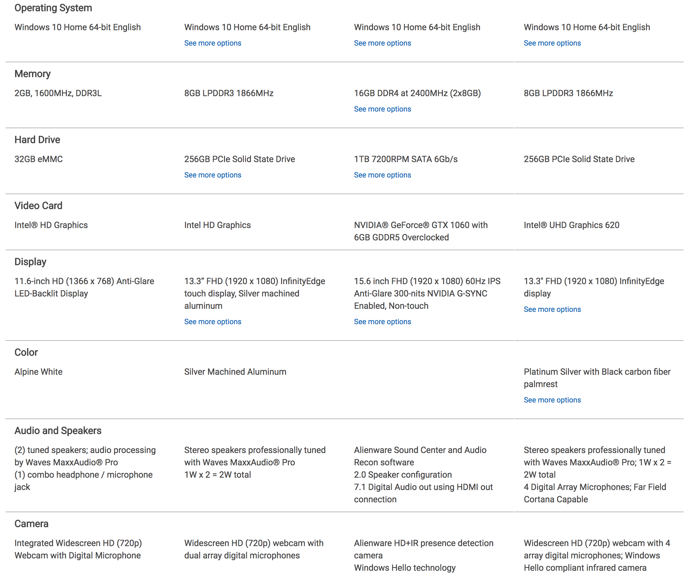
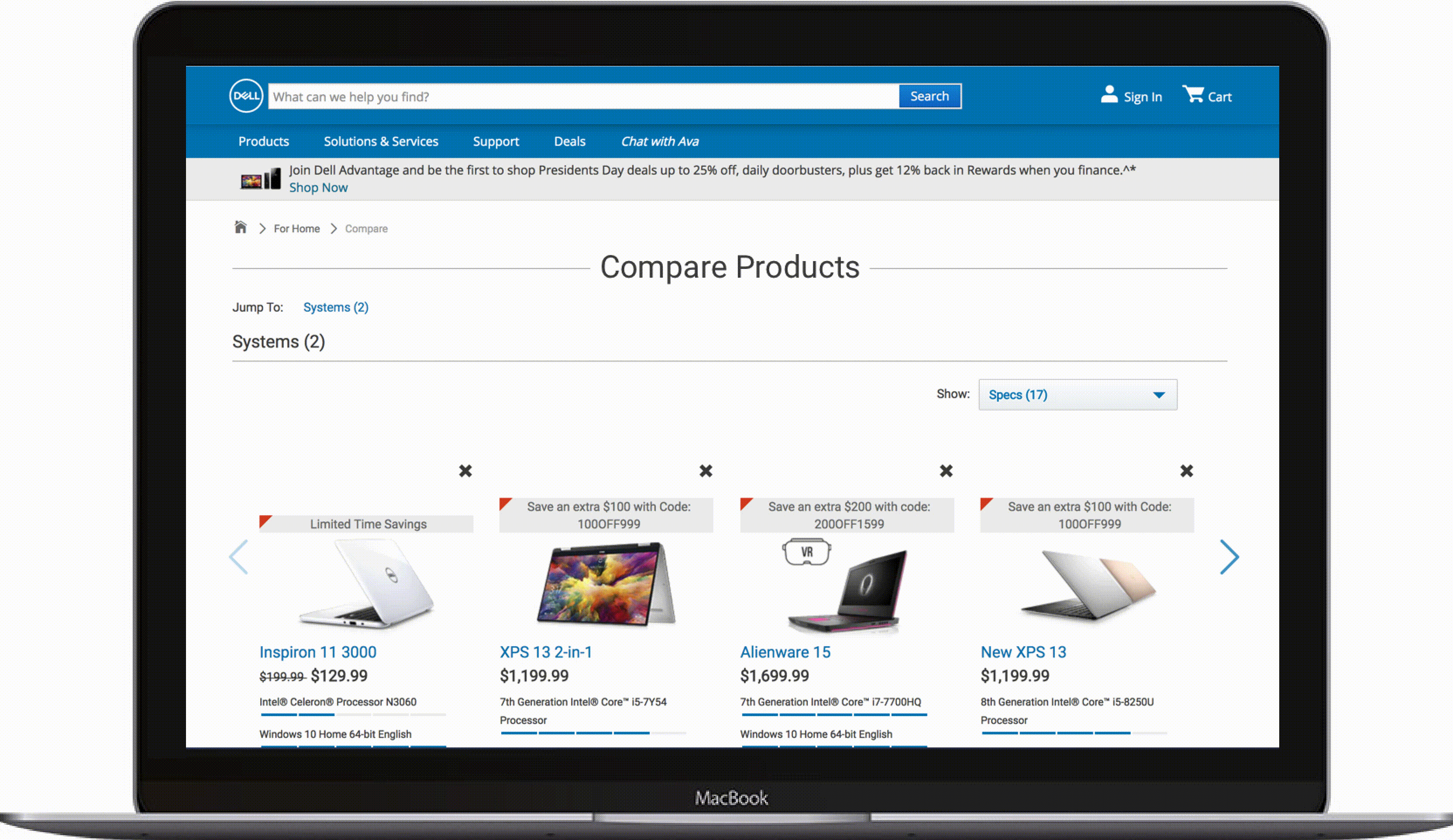 scrolling through a lot… of information
Challenge
Comparing multiple laptops at once is difficult, especially if you aren’t familiar with technical jargon. How can we improve the usability of a laptop comparison tool to aid users in making their purchasing decisions?
Comparative Analysis
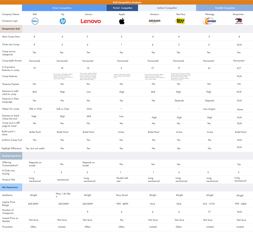
The realm of e-commerce has countless product-comparison tools. We began the process by conducting a comparative analysis to find the patterns in the market, and the users’ common needs. The selection of competitors was based on leading laptop brands and popular online sellers.
Findings
Common practices of competitors Common practices of having up to 4-comparisons simultaneously in table-formats
Simple language Better tools by the competitors speak a simple language, easy for anyone to understand. For example, Apple explained the approximate use of their laptops by hours, for their batteries. Watt-hours(Whr)anyone?
Lack of creativity No competitors went above and beyond to help users make their decisions, unless they were in articles to rank “best laptops for …”, no creative help when comparing!
Minimalist designs with plenty of whitespace Best and the prettiest tools took advantage of whitespace and clean typefaces
Heuristic Evaluation
After identifying market standards for comparison tools via the comparative analysis, we created an in-depth analysis of Dell’s current laptop comparison tool through heuristic evaluation (as per Nielsen’s Heuristics). The following are the three lowest-evaluated heuristics.
Evaluation Results
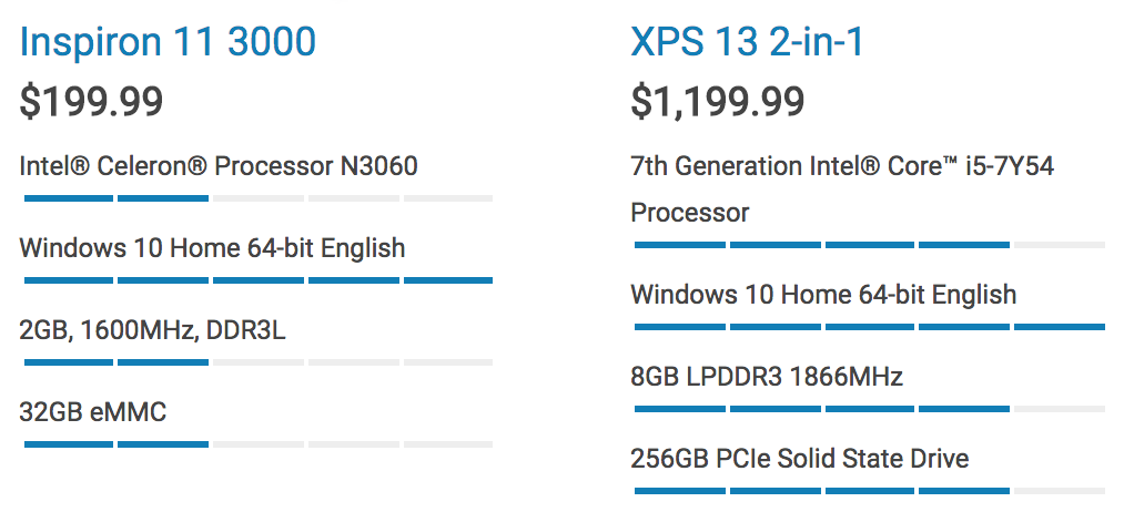
“Match between System & Real-World” Dell’s comparison tool did not speak a language that every potential persona would. The tool is filled with technical jargon such as ‘SSD’ and ‘1.2mm travel chiclet keys’. Users with little to no technical familiarity would have no idea what they mean.
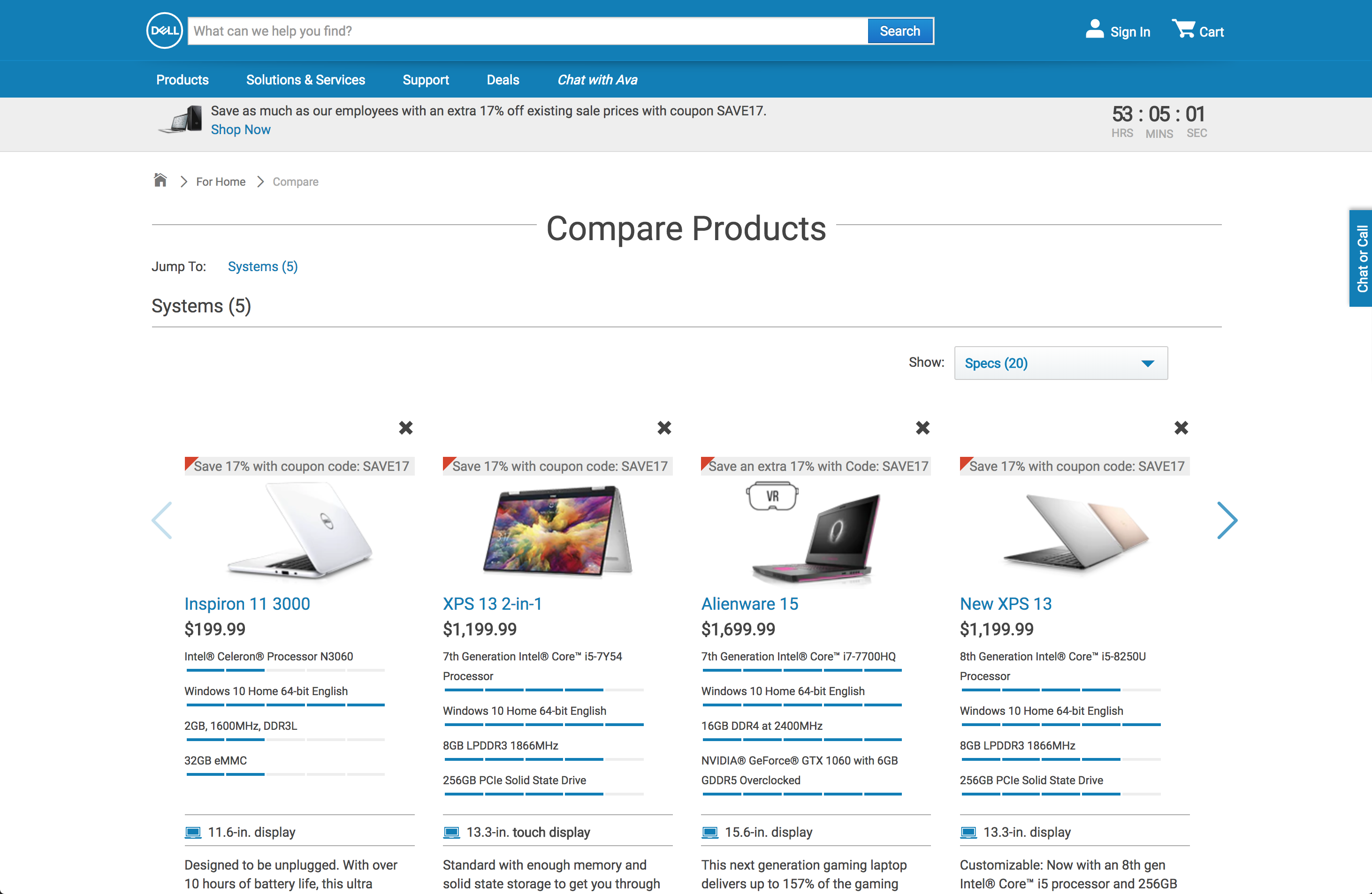
“Aesthetics & Minimalistic Design” The amount of information relayed to the users were abundant but overwhelming. Every character in an interface fight for the users’ attention. The tool wasn’t cutting to the chase–overburdening users with information they don’t always need.
“Consistency & Standards” The tool would not be able to fill out every listing of the laptops’ components. If the maker of these laptops don’t have these tech-spec information regarding their products, where else can users go? In addition, there were visual highlighting done inconsistently throughout the tool’s interfaces, which may mislead users.
Personas & Journeys
After the preliminary research on the tool, the team created 3 personas of potential users that would dictate the team’s design decisions going forward with designs. We came across an interesting problem where we initially thought that a user’s technical expertise would directly correlate with his/her technical-requirement. Through user surveys and interviews, we found that wasn’t the case at all.
Personas
Low-Tech Requirement The everyday casual users for streaming videos and drafting documents.
Medium-Tech Requirement Students and people who need slightly faster and more powerful laptops for school, work, and multimedia purposes.
High-Tech Requirement The professionals, gamers, and hobbyists that really need the rendering and multitasking power.
Usability Tests
Evaluations and analysis on the tool are great ways but it was time to ask the potential users, and study their interactions and thought processes.
Findings
“Don’t repeatedly prompt users” Users despise it when websites repeatedly prompt them to do something.

“Pretty won’t always work” Dell implemented a blue-bar rating system for a few components that looked clean; however, testers had trouble understanding the benchmarking system.
“Users want to see the differences” Users want to see the differences between products, not just the specifications.
“Users want to see the differences” Users want to see the differences between products, not just the specifications.
Design Solutions
Based on our research findings, we proposed several design solutions to improve the Dell laptop comparison tool:
- Simplified Language: Replace technical jargon with user-friendly terms
- Visual Hierarchy: Use whitespace and typography to improve readability
- Progressive Disclosure: Show essential information first, with options to expand for details
- Comparison Highlights: Visually highlight differences between products
- Contextual Help: Provide tooltips and explanations for technical terms
Results
Our recommendations were well-received by the Dell team, and several of our suggestions were incorporated into future iterations of the comparison tool. The project demonstrated the value of user-centered design in improving e-commerce experiences.