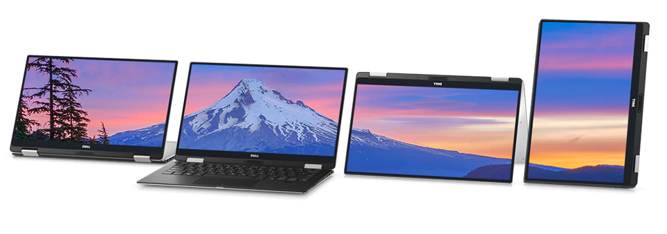


The Order Experience team at Dell is currently exploring ways to make products easier to buy.
In line with this idea, they wished to test the user experience of the comparison feature, which allows users to compare laptops on Dell.com.
I worked in a team of 3 other student designers to evaluate the then-current state of the feature, and made creative design suggestions to enhance the usability.
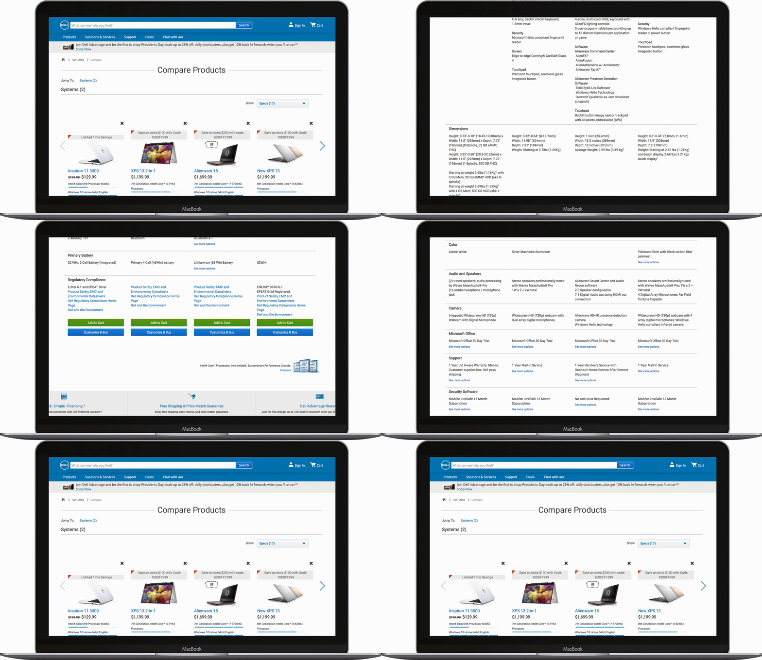
scrolling through a lot... of information
Comparing multiple laptops at once is difficult, especially if you aren't familiar with technical jargon. How can we improve the usability of a laptop comparison tool to aid users in making their purchasing decisions?
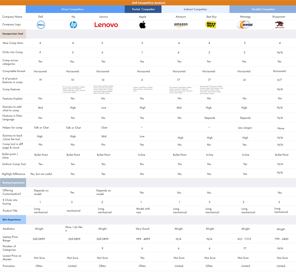
The realm of e-commerce has countless product-comparison tools. We began the process by conducting a comparative analysis to find the patterns in the market, and the users' common needs. The selection of competitors was based on leading laptop brands and popular online sellers.
Common practices of having up to 4-comparisons simultaneously in table-formats
Better tools by the competitors speak a simple language, easy for anyone to understand. For example, Apple explained the approximate use of their laptops by hours, for their batteries. Watt-hours(Whr)anyone?
No competitors went above and beyond to help users make their decisions, unless they were in articles to rank "best laptops for ...", no creative help when comparing!
Best and the prettiest tools took advantage of whitespace and clean typefaces
After identifying market standards for comparison tools via the comparative analysis, we created an in-depth analysis of Dell’s current laptop comparison tool through heuristic evaluation (as per Nielsen's Heuristics). The following are the three lowest-evaluated heuristics.
Dell's comparison tool did not speak a language that every potential persona would. The tool is filled with technical jargon such as 'SSD' and '1.2mm travel chiclet keys'. Users with little to no technical familiarity would have no idea what they mean.
The amount of information relayed to the users were abundant but overwhelming. Every character in an interface fight for the users' attention. The tool wasn't cutting to the chase–overburdening users with information they don't always need.
The tool would not be able to fill out every listing of the laptops' components. If the maker of these laptops don't have these tech-spec information regarding their products, where else can users go? In addition, there were visual highlighting done inconsistently throughout the tool's interfaces, which may mislead users.
After the preliminary research on the tool, the team created 3 personas of potential users that would dictate the team's design decisions going forward with designs. We came across an interesting problem where we initially thought that a user's technical expertise would directly correlate with his/her technical-requirement. Through user surveys and interviews, we found that wasn't the case at all.
The everyday casual users for streaming videos and drafting documents.
Students and people who need slightly faster and more powerful laptops for school, work, and multimedia purposes.
The professionals, gamers, and hobbyists that really need the rendering and multitasking power.
Evaluations and analysis on the tool are great ways but it was time to ask the potential users, and study their interactions and thought processes.
Users despise it when websites repeatedly prompt them to do something.

Dell implemented a blue-bar rating system for a few components that looked clean; however, testers had trouble understanding the benchmarking system.
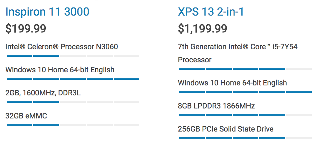
According to research, it takes 50 milliseconds for users to make a first-impression on a website. At the landing screen of the tool, there is nothing that users can relate to it visually.
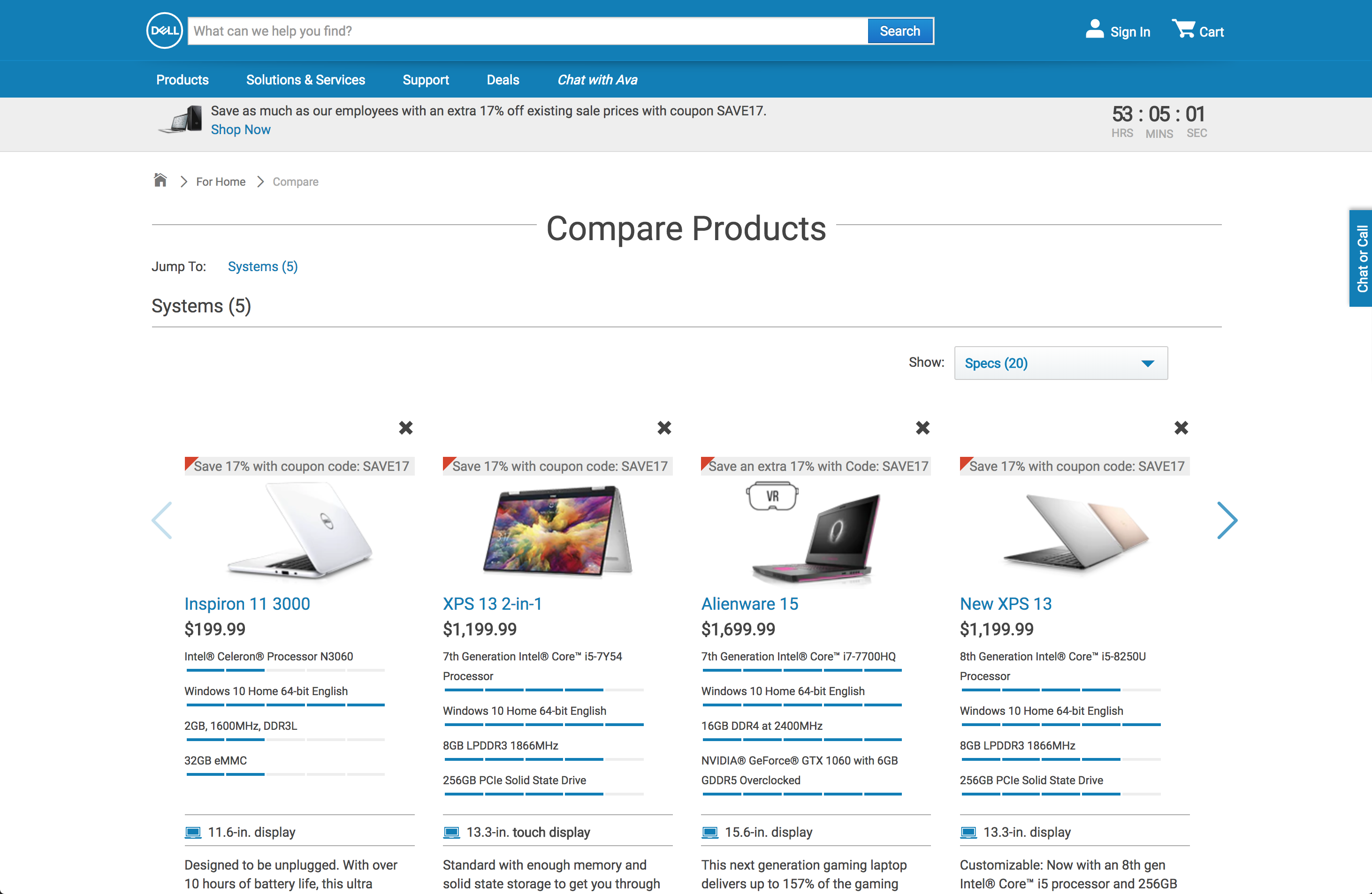
Forcing users to make a decision by limiting their choices is one thing, but a comparison tool not helping the user compare? Testers wanted visual cues and patterns to make quick and easy decisions. Do you see anything on the left other than a wall of text?
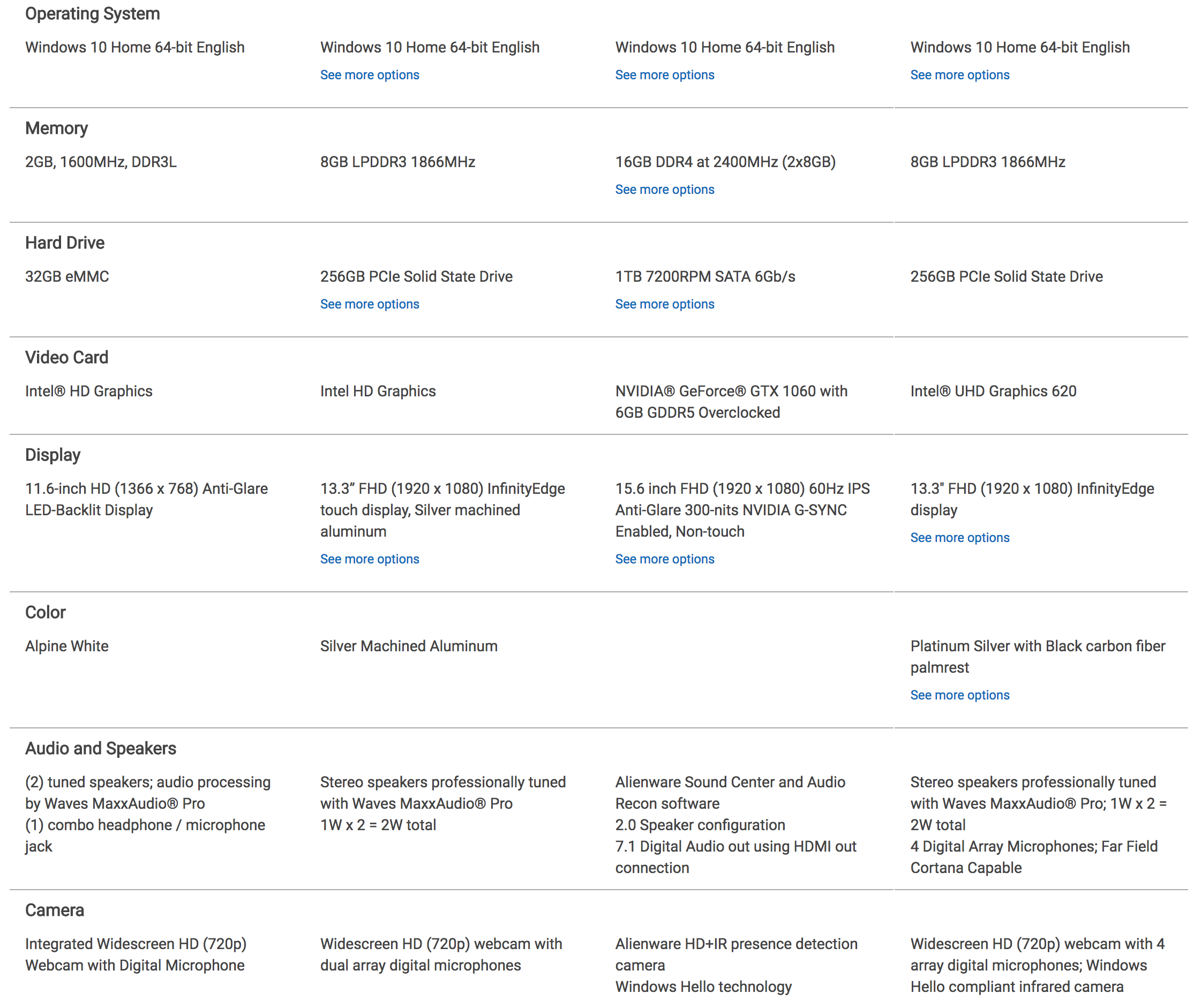
When creating our personas, we thought users with high-technical requirements were always correlated with being a tech-savvy gamer. We found this to not be true at all, as we have overlooked gamers with little technical expertise and gamers that did not care for gaming on their laptops.
With all the insights gathered in the previous stages, we began sketching and passing around ideas. Through a few rounds of iterations with feedbacks, I created a prototype for validation testing.
We explored ways to visually indicate the differences between comparisons. Relying solely on colors may pose an accessibility issue to color-blind users.
We conducted many card sorting exercises and asked potential users to help us arrange the laptop components in the order of importance. They all showed a similar pattern depending on their intended use for the laptops: gaming, casual, school, and etc. We made these laptop-components features into different pre-set categories. No more endless scrolling!
The original tool emphasized a vertical distinction between products, which went against the users' subconscious tendency to compre components side-by-side. Following a better practice by one of the competitors in the industry, we horizontally grouped together same components from each product in clean list format.
Good designs minimize the memory burden on the users, rarely relying on the users to memorize and recall information. The original tool lacked this ability–for instance, while scrolling down the long list of components, the columns-to-product relationship would be lost. No more memorizing which column belongs to which laptop!
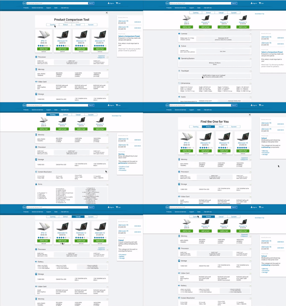
With the above interactive prototype, we've conducted validation tests to see if our design had an impact on testers' performances.
Because we wanted to compare the performances of the testers on both designs (original and new), we conducted within-subject A/B tests. Every tester was required to go through a few hypothetical scenarios and complete a set of tasks, on both versions of the tool.
During each testing sessions, the team gathered both qualitative and quantitative data to benchmark the performances.
Task completion time, SUS Questionnaires, and click attempts.
User actions, thought processes, repetitive error patterns, first-impressions, emotional distress points, and pain-points.
Through the validation test results, we've compiled and adjusted the features for our final design.
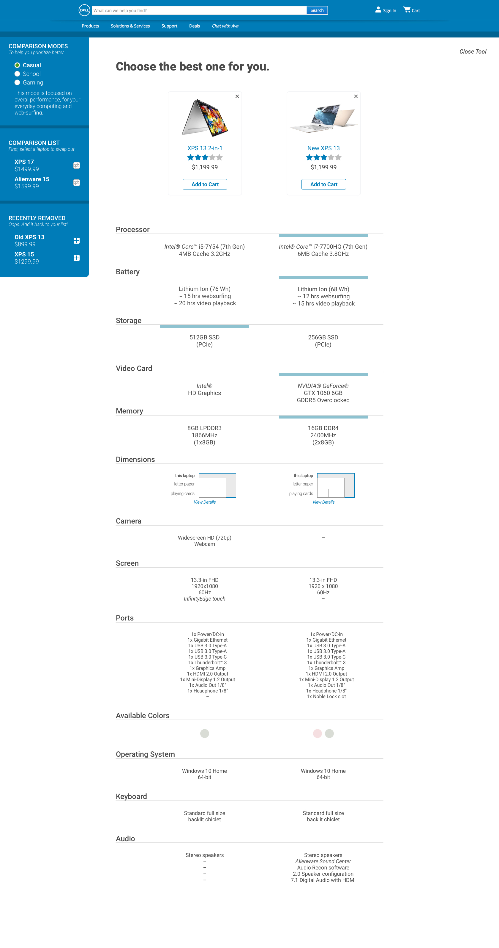
When creating personas for this project, I quickly assumed that a technical requirement of a persona would directly correlate with their technical-knowledge. That was definitely not the case as per our user research! People who are keen with technology may not need or want a powerful computer.
No hard-feelings Dell! But this was the first project that I've done with a company this size; I always thought that well-established companies such as Dell would have a very good grasp of their users/customers. I am glad I was able to contribute to such an establishment, and hope to be able to contribute to more companies.
To create our interactive prototype, InVision(app) was not enough to translate our ideas and interaction pieces. I picked up a neat software called Principle to package our ideas into one interactive prototype.